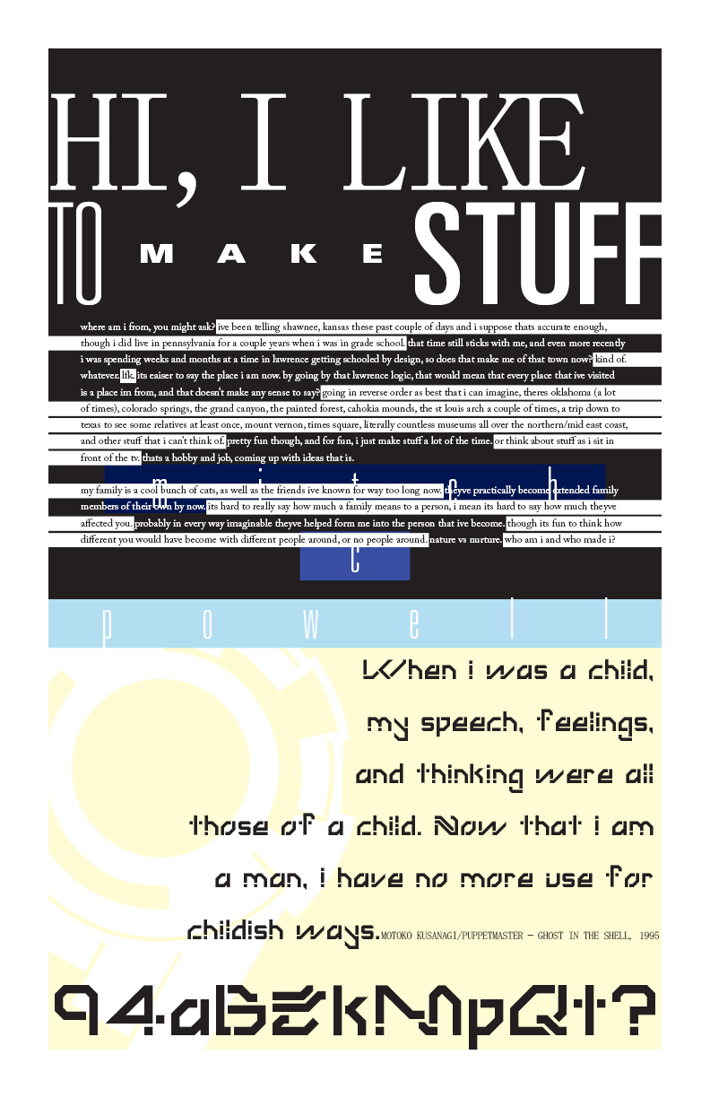
After I graduated from college in 2017, the first design job I landed implored me to create a poster explaining myself so that the rest of the team could get to know me better. That I did, designing the first poster (of black, blue, and yellow) and filling it with my mindstate at the time, as well as a brief and chaotic biography. More than that, I added references to one of my favorite movies and exemplified that aesthetic by using a typeface I had designed for said quote. That blocky, sci-fi typeface is called Brain Dive, and I designed it during my time at KU.
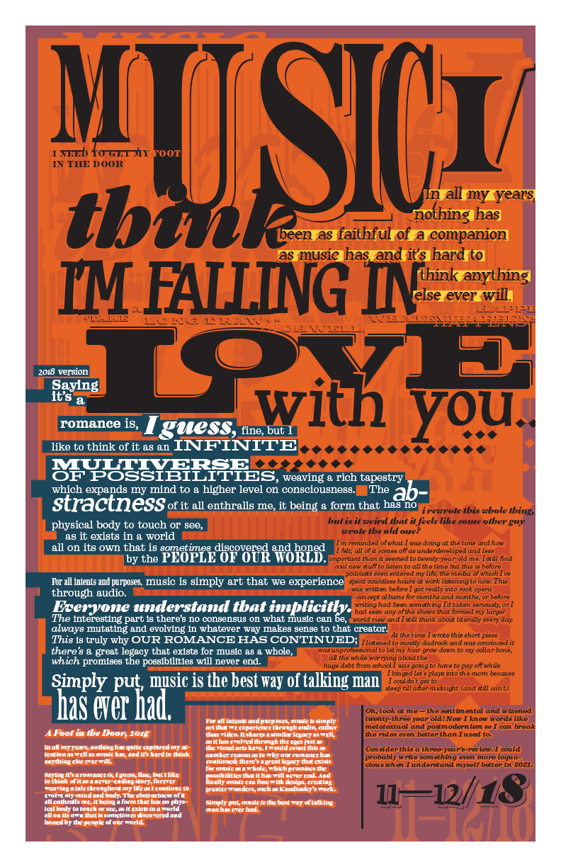
The second poster (of orange, violet, and navy) I designed a year and a half later to compliment and expand upon that first design. Music has defined my life in many ways, a shared experience which many people have had, and much like in the first poster I wanted to put those feelings to print. The text reflects this concept, detailing my thoughts on music's importance by using typography for added emphasis. It also includes obscured quotes and references to other media, as an echo to the first poster, and as a way to capture my emotions at the time, like a time capsule.
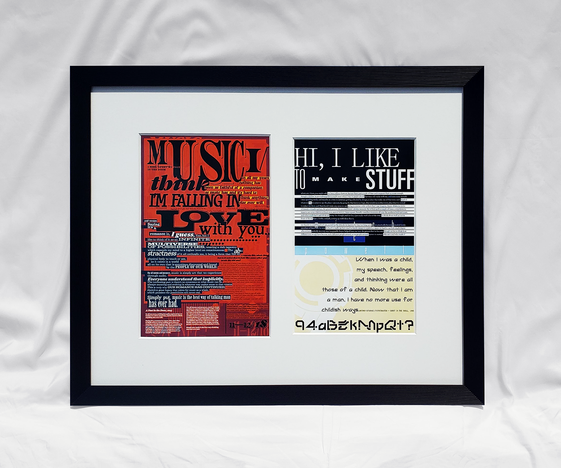
At the bottom left, I have an earlier version of the same text, titled "A Foot in the Door" and following a review of the poster, found on the right side. I chose to include these metatextual elements as a way of making sense of the whole project and being as genuine as possible with the audience. It serves as yet another time capsule in that regard, capturing my past self's outlook on yet another past self. And from here, who knows? I may need to make a third addition to this series, like stated in the bottom right, once 2021 arrives.