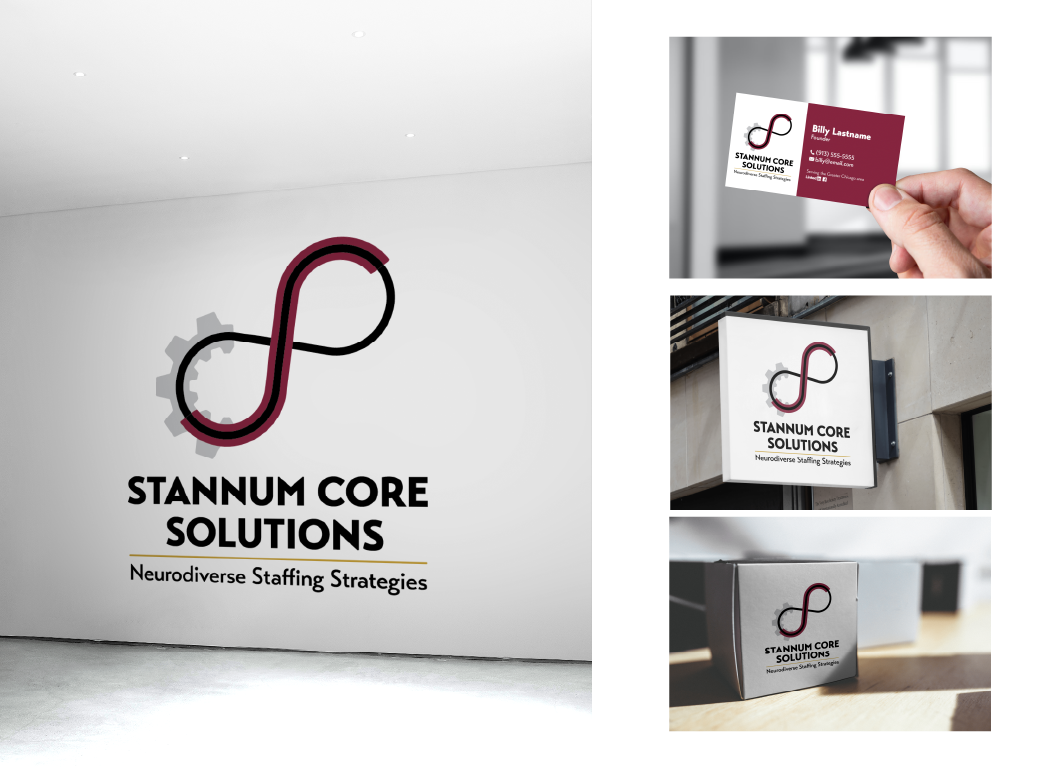
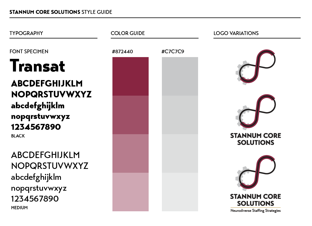
I worked closely with the client to redesign his brand and logo, developing everything from his color scheme to appropriate typeface choice.

Brief: customer wanted a design that would incorporate several distinct elements: a gear, an infinity symbol, and the acronym of his company: “SCS”

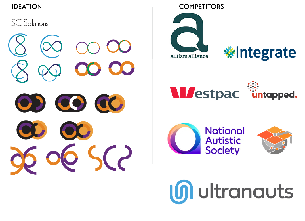
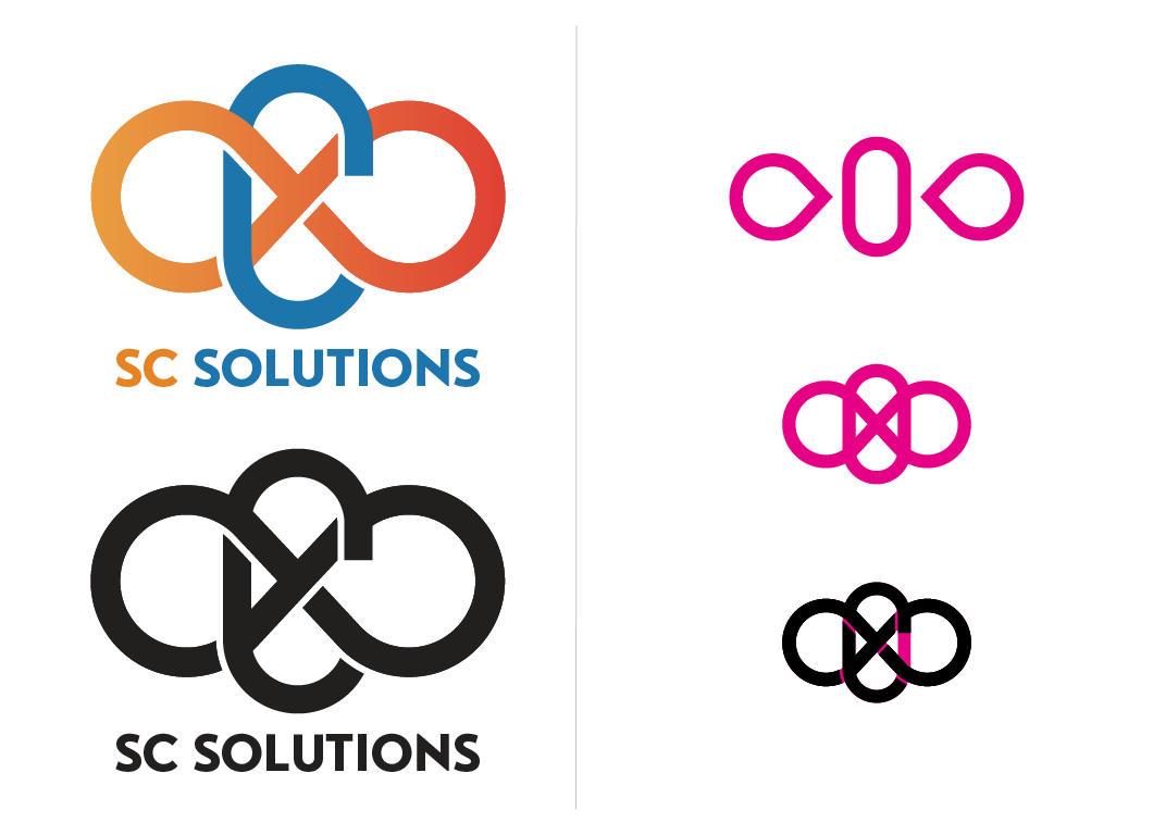
First Proof: In the end, I decided to create a simple interlocking design that clearly distinguished between the different elements. This would go on to influence revised designs.
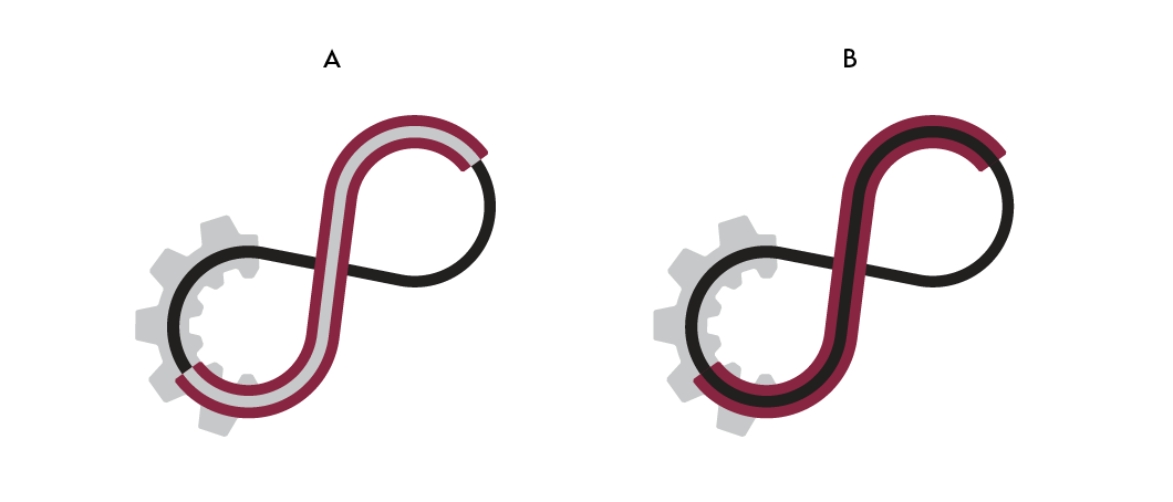
Second Proof: we decided to merge my ideas with the client's original concept, now with the gear incorporated.

Third Proof: upon reflection, we decided that using a color scheme similar to his old logo would work much better.