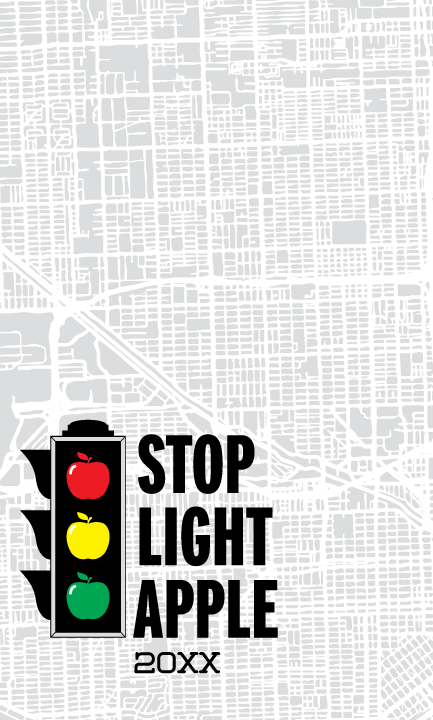
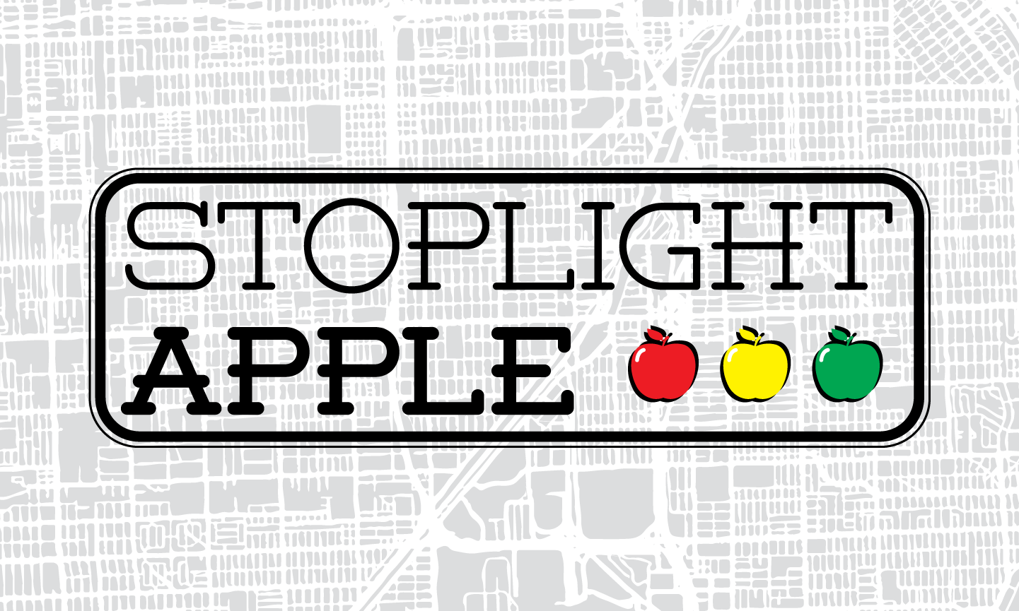
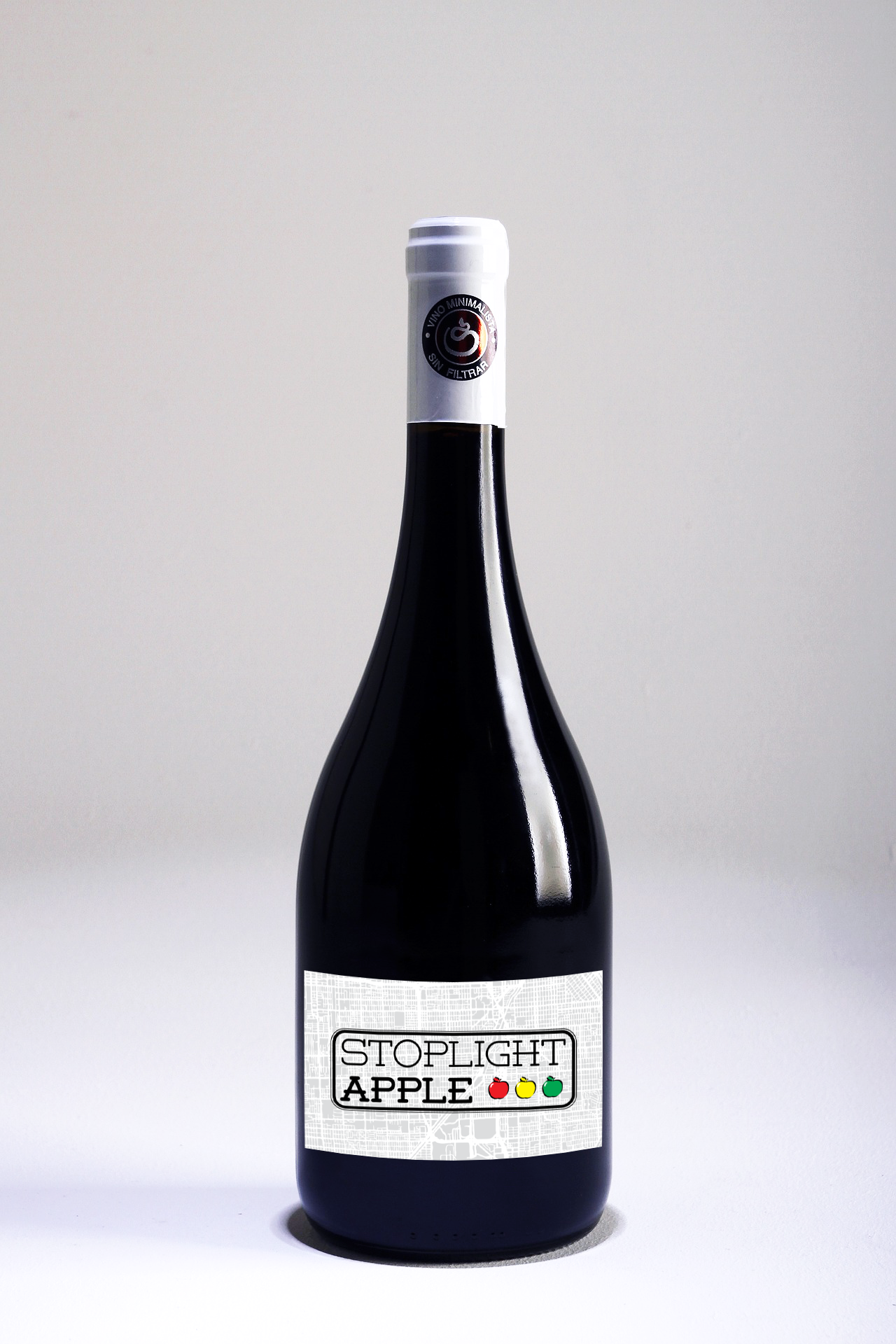
Coming from a family of wine enthusiasts, it seems like fate that I'd eventually design some labels for that delightful vice. One of my uncle's wines is made from apples, squeezed and aged into a cool and sweet beverage which is one of my favorites, so that was my subject.
My thought process took me in three different directions, but all have the same background, that of a sprawling metropolis. Besides adding some wonderful texture, it helps ground the concept, putting you in an urban mindset and complimenting the stoplight gimmick. Apples generally come in red, yellow, and green, so attaching that to the image of a stoplight brings the whole concept home. It is the true symbol of this label, exemplified in all three designs, though sometimes less literally. I attempted to use the apples without the container in two of the designs, putting more emphasis on the contents of the bottle rather than the brand itself.